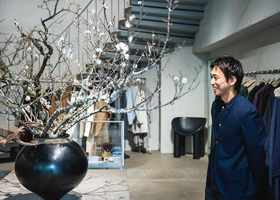
How Kazuya Sasaki first met Sonya Park, the owner of A&S, and the journey that led to his involvement in designing multiple shops
-
-
A&S (Hereafter, A)
The first A&S store opened in Daikanyama in 2003, a small shop of about 9 tsubo (around 30 square meters.) It was the first store that Sonya had ever worked on, filled with sentiment and marked by a process of trial and error, I’ve heard. I believe that’s where you first met Sonya.
-
Sasaki (Hereafter, S)
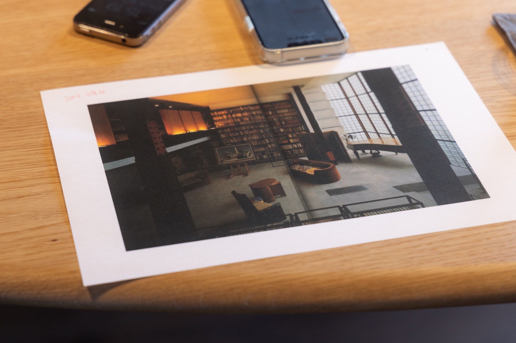
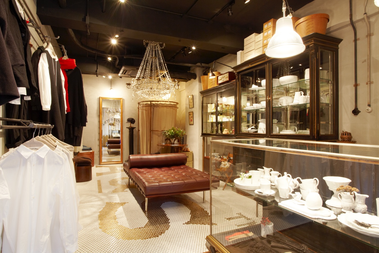
I started my career at LINE INC., an interior design company led by Takao Katsuta. This was around one or two years after I graduated from university. When I first met Sonya, she shared with me a photo of Pierre Chareau’s Glass House, which left a significant impression. The notion of “form follows function” from that house became a guiding principle for my subsequent spatial designs. It took me about ten years before I was finally able to visit the actual site. Sonya had numerous ideas, and one day, she mentioned wanting something akin to a bathroom for the shop, something unconventional. She didn’t want it to be just another ordinary store. At that time in Paris, there were actually establishments that used to be residential spaces or stores but were turned into cafés without undergoing major renovations. They were formerly butcher shops or even bathrooms. Drawing from that concept, we created the space using vintage European furniture, tools, and reclaimed materials.
-
A
At that time in Japan, the practice of deliberately incorporating old items into modern properties might have been quite innovative. Sonya, being naturally drawn to vintage pieces, would scour flea markets and interior shops across various countries in search of quality finds. That’s how the former A&S Daikanyama store was curated.
-
S
Sonya carefully selected high-quality and well-designed fixtures like chandeliers, glass cabinets with cabriole legs, and tables and chairs for the garden. Focusing on these as the main elements, we approached the space with a sense of creating simple boxes. The only intricate detail was perhaps the floor tiles. We decided to showcase the A&S logo in gold tiles on a base of white tiles. However, achieving the precise alignment of the letters posed quite a challenge, and I remember the process of trial and error as we meticulously worked on the detailed drawings.
-
-
-
A
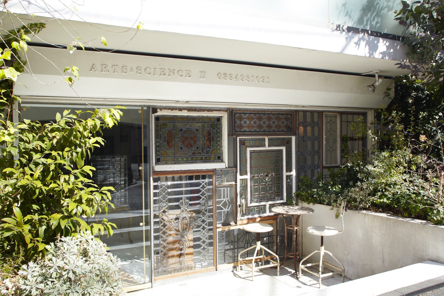
I heard that the gold tiles were quite expensive. Sonya mentioned that she was glad we didn’t give up on using them and was pleased with the outcome. In the following year, in 2004, the original A&S Aoyama store opened, followed by SHOES and THINGS in 2006. Each store has its own unique atmosphere, doesn’t it? According to Sonya, it’s all about the spontaneous moments of inspiration and encounters. In the former A&S Aoyama store, she incorporated stained glass pieces she had been collecting, embedding them into one entire wall near the entrance.
-
S
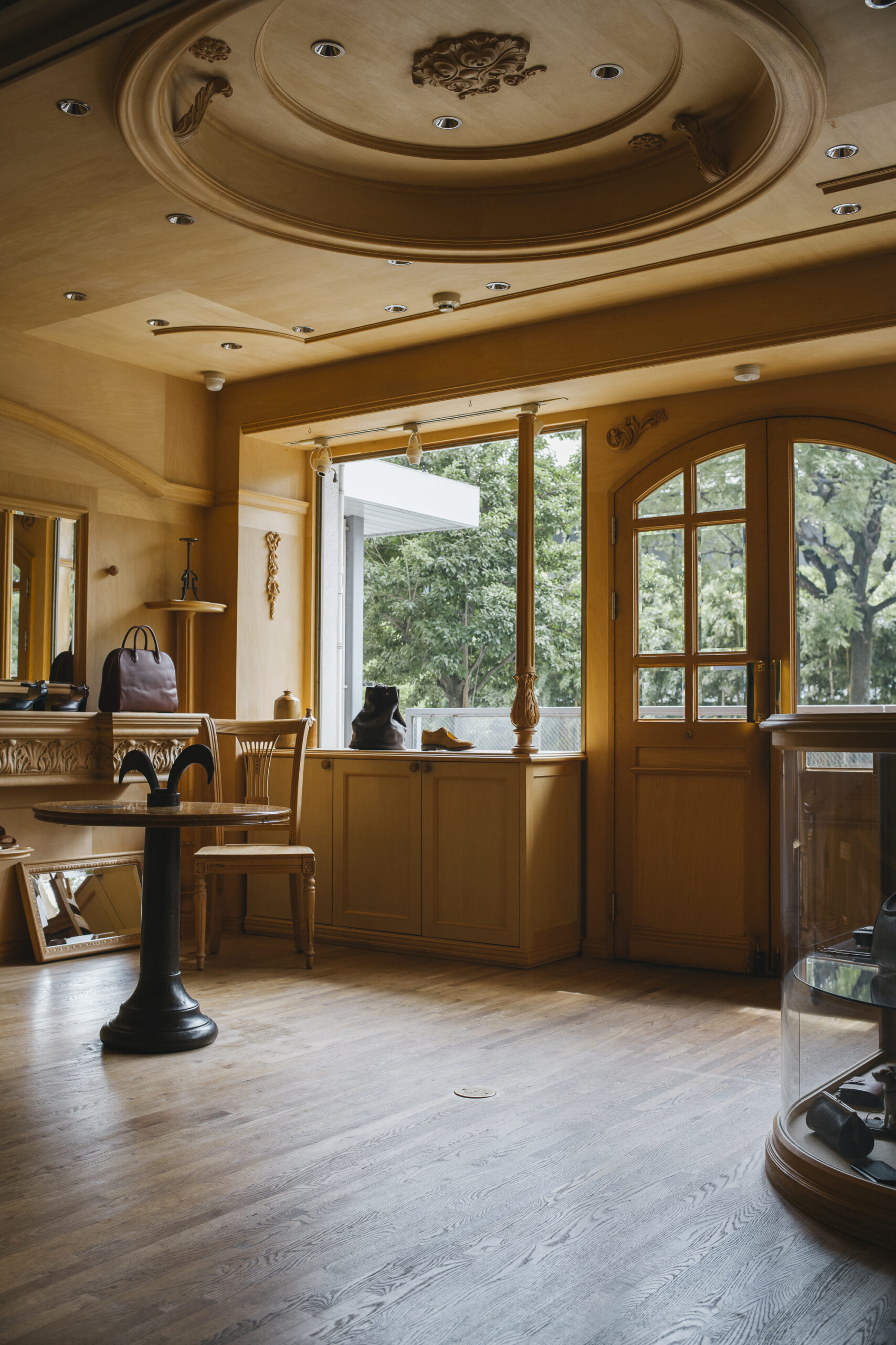
That’s right. It became a remarkably striking decoration. The inspiration for SHOES and THINGS came from our encounter with moldings, which are typically used to adorn ceilings and walls. We were able to repurpose leftover stock from the bubble era in the warehouses of our trading partners, imported from the United States and Europe. We decided to leave the moldings unfinished, with exposed edges or only the layout lines visible, without applying any finishing paint, or we used them in their natural state. Instead of opting for a purely classical aesthetic, we gave it a contemporary finish by stopping the production process midway.
-
A
And in 2007, A&S Marunouchi became our only shop within a commercial facility. What was the concept behind this store?
-
S
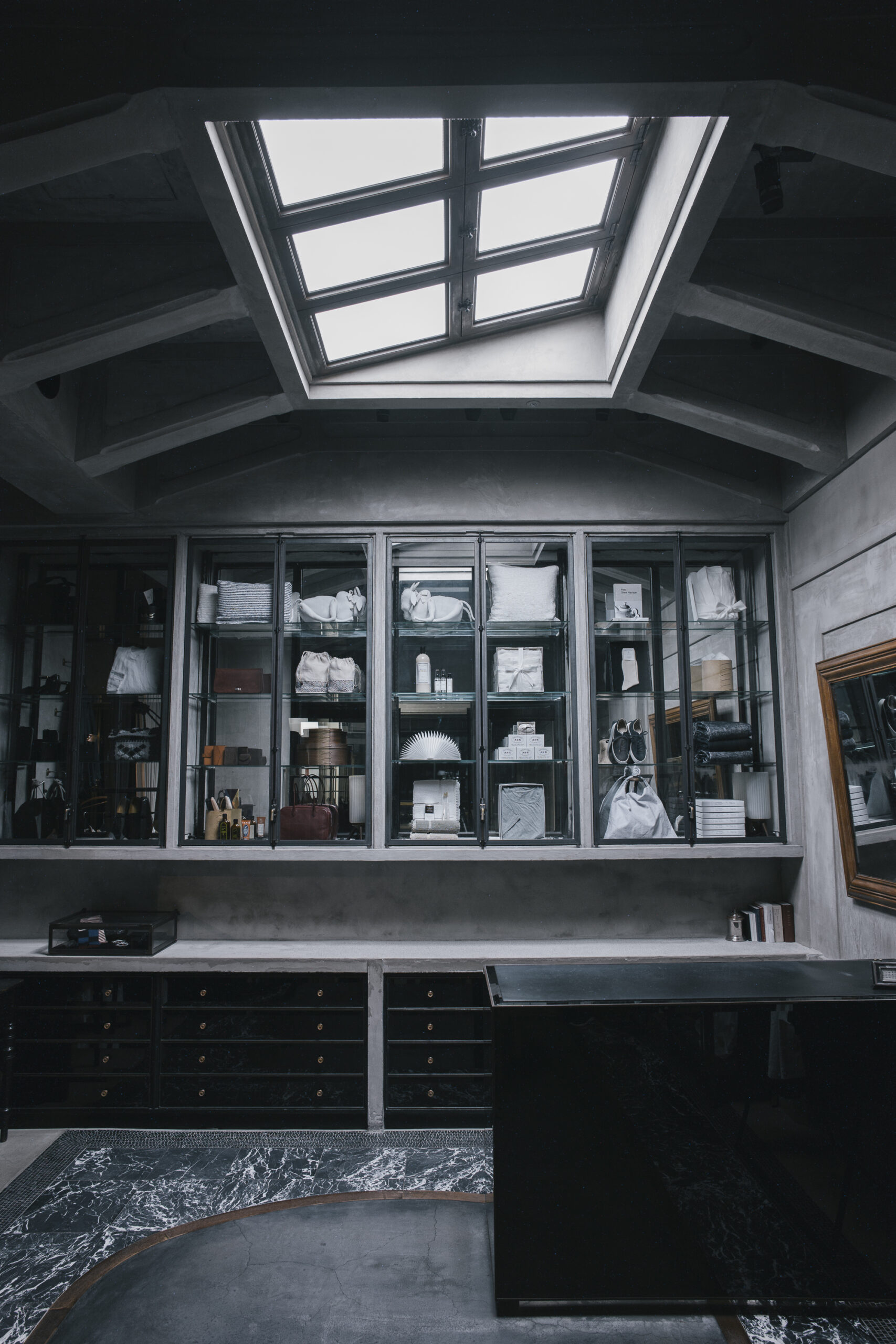
Since the store had very high ceilings, we envisioned lighting that evoked the image of natural light streaming in through skylights, reminiscent of Parisian passages. Additionally, Sonya stumbled upon tall black cabinets in Paris, which we could only install because of the store’s lofty height. It was yet another fortuitous encounter. We also adorned the facade with expansive round glass panels, and meticulously handcrafted marble mosaics graced the floors…there were no compromises made (laughs). European influences might have been particularly strong during this era.
-
Reflecting on two significant stores that acted as turning points
-
-
S
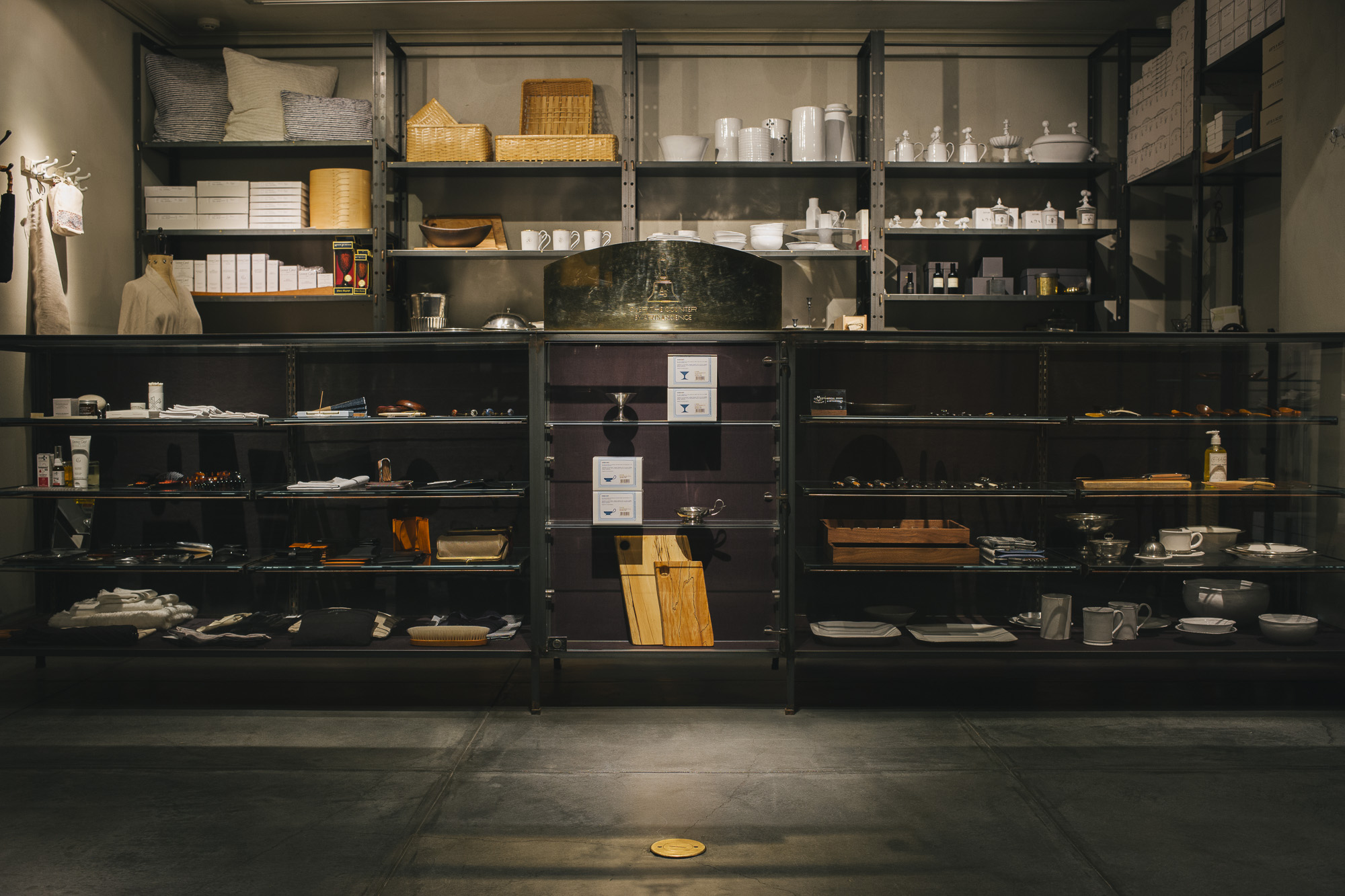
The former OVER THE COUNTER store, which opened in 2009, holds a special place in my memories. Built on the concept of dialogue between customers and staff across the counter, we emphasized simple details to elegantly showcase their interactions and gestures. Choosing a grey plaster finish for the walls marked a turning point in our subsequent store interior designs.
-
A
This store initially occupied the ground floor of a building called Palace Miyuki and garnered significant attention from international magazines (It relocated to Palace Aoyama in 2019 due to the demolition of the original site). It was a time when the growing popularity of online shopping prompted us to reflect on sales strategies. The store aimed to inform customers about the backstory of each product through dialogue, fostering a sense of connection and encouraging thoughtful selection.
-
S
The decision to paint the walls grey at that time served a dual purpose: it not only enhanced the visual appeal of the products but also had a practical aspect. This setting, formerly a tatami-floored guardroom located right next to the parking lot, contributed to the store’s unique and innovative atmosphere.
-
-
-
A
Many people became fans of A&S through this store, and the store itself became an important venue for meaningful expression.
-
S
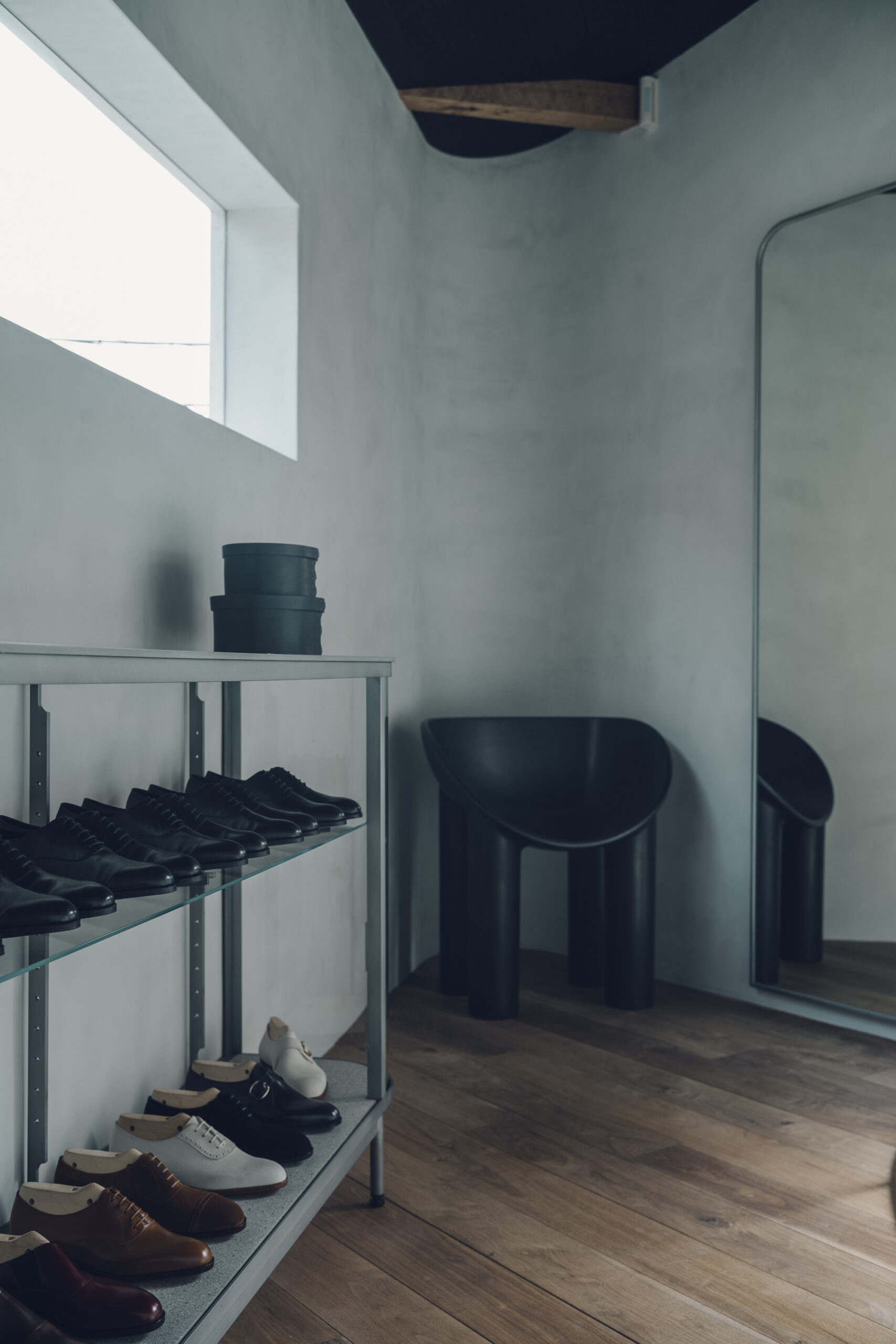
I’m glad to hear that. Although it’s always quite challenging, the most difficult design project for me was CORNER in Kyoto in 2018. It was a small triangular building of about 5 tsubo (16.5 square meters), and I really struggled with that one.
-
A
It’s the shop where Sonya had the ingenious idea to turn the triangular corner into an arch.
-
S
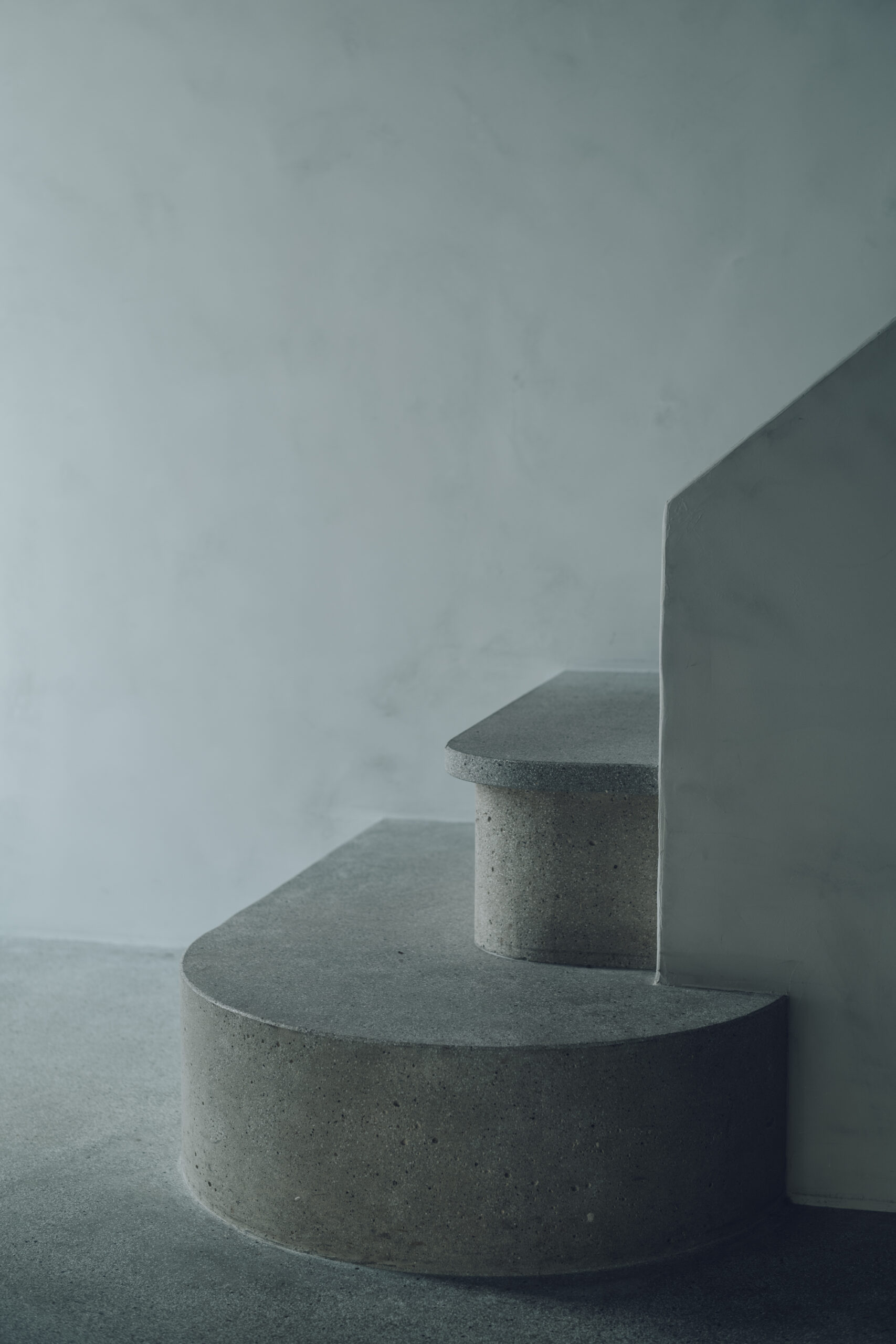
That’s right, and we came up with a solution just in time (laughs). The triangular shape created a sense of depth and confinement when viewed from the inside. By shaping the corners of the walls into arches, the space gained a flowing, cohesive feel. And when we opened up the small existing window, we were pleasantly surprised to discover a beautiful neighboring garden, so we expanded the window to incorporate the scenery. There were quite a few surprises along the journey.
-
In Volume 2, to be released on Friday, March 29th, we will focus on A&S Daikanyama, and then, onto the new store in Zaimokuza.
〈Interview with Kazuya Sasaki – vol.2〉
Text by Naoko Sasaki
PROFILE
Kazuya Sasaki
SMALLCLONE co.,ltd.
Born in 1977 in Iwate Prefecture. Graduated from the Department of Architecture, Faculty of Engineering, Kanagawa Institute of Technology. Worked at EXIT METAL WORKS SUPPLY~LINE INC. from 1999 until becoming independent in 2008. Founded the design firm SMALLCLONE co., ltd. in the same year.
