A&S Daikanyama and the new store in Zaimokuza
-
-
A&S (Hereafter, A)
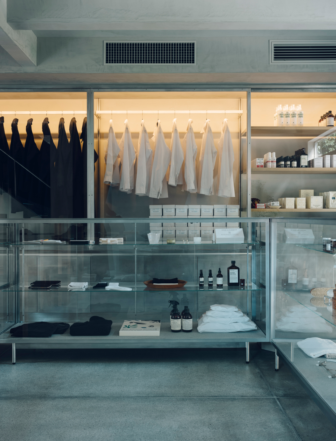
You’ve been involved in A&S’s interior design for nearly 20 years and have earned Sonya’s deep trust, consistently delivering successful outcomes and impressing with new discoveries. A&S Daikanyama, which opened at its current location in 2018, was conceived from an encounter with a standalone property. It seems that during a property visit with Sonya, you came up with the interior theme of “aluminum.”
-
Sasaki (Hereafter, S)
I felt like I had exhausted the options with metallic finishes, so aluminum seemed refreshing. I try to make decisions independently to avoid burdening Sonya, ensuring that I’ve thoroughly assessed all aspects beforehand. When I do seek advice on truly challenging decisions, it often leads to new insights, prompting updates in other areas as well.
-
A
Collaboration brings an element of excitement, doesn’t it? A&S Daikanyama is situated in a quiet residential area, and we aimed to create a space where local residents could casually drop by and enjoy shopping at their own pace.
-
S
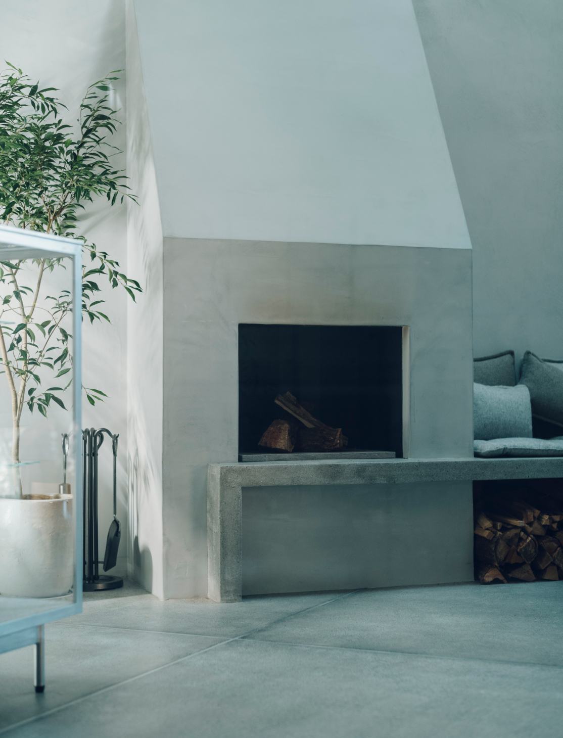
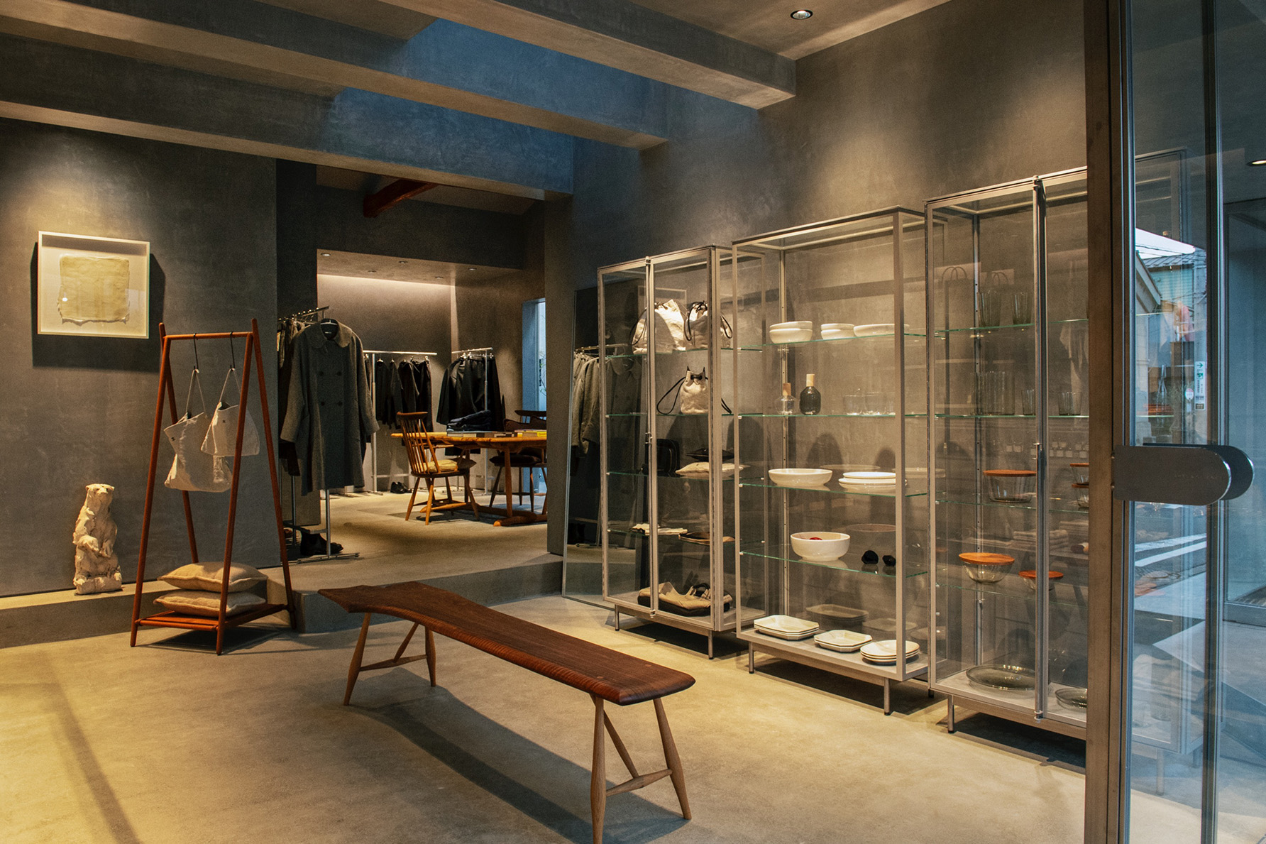
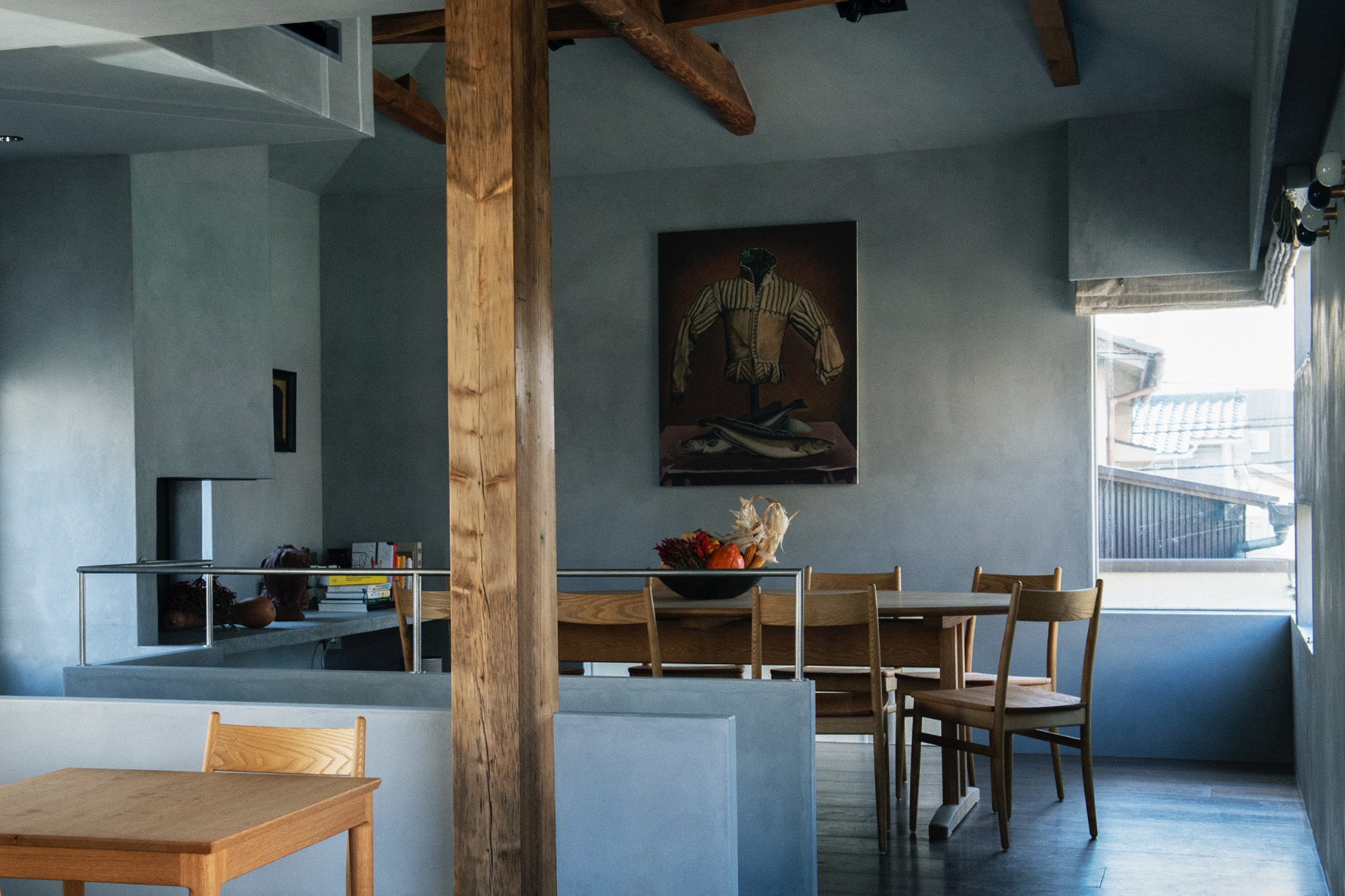
Located in a tranquil environment, the building itself had the aura of an expatriate house from the 1970s. It’s all about starting with the structure itself and capitalizing on its strengths. Our goal was to design a space flooded with natural light, offering a serene environment akin to being at home.
-
-
-
A
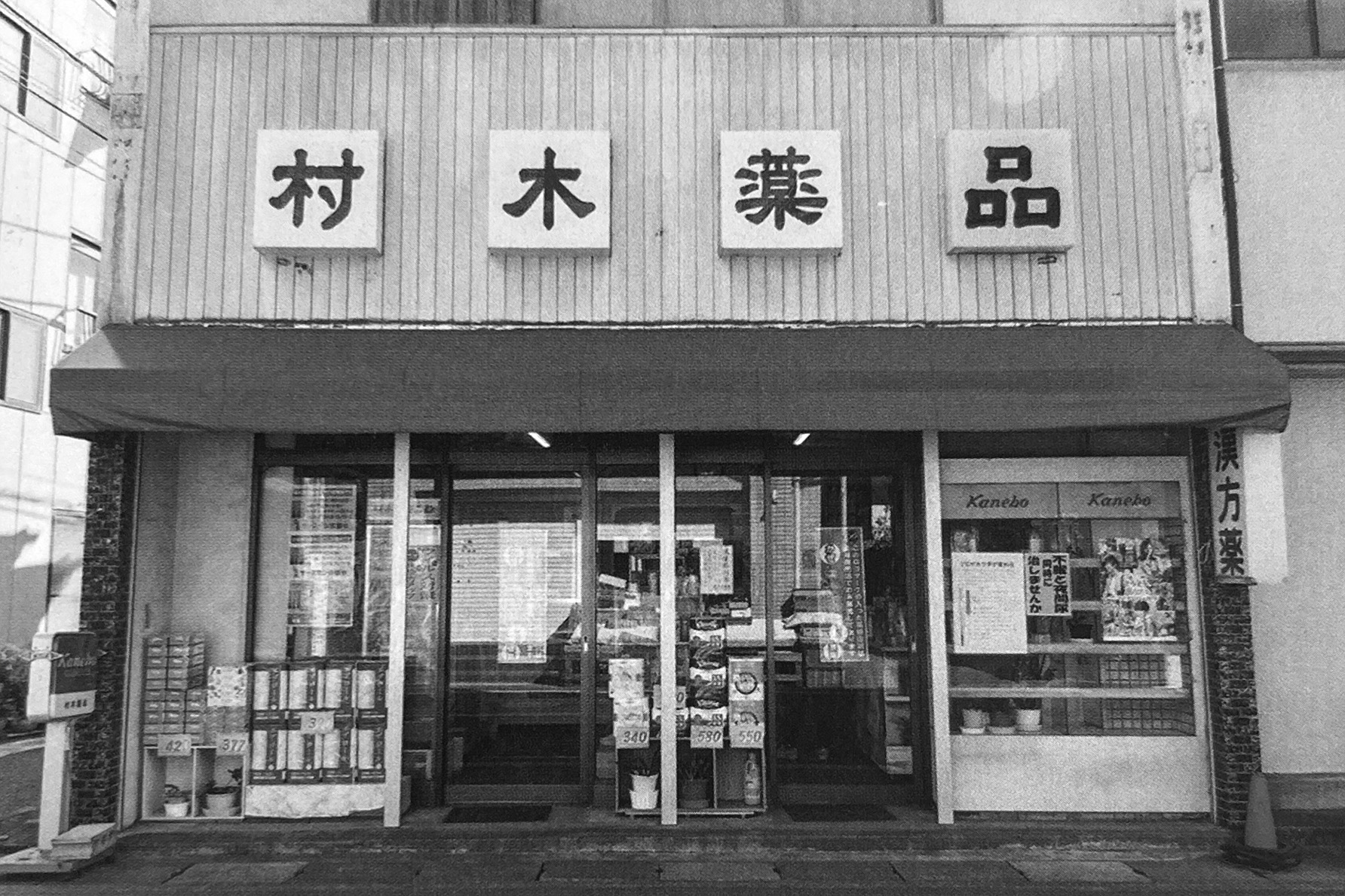
Encountering the right property was also the catalyst for the Zaimokuza store in Kamakura. Opening a store in Kamakura had been Sonya’s long-standing wish, and she had actually been searching for the right space for over a decade. Given its location some distance away from Kamakura Station, we arranged for you to visit and assess the site before making the final decision.
-
S
Hearing about the pharmacy that occupied that site and that had been an integral part of the community for over 90 years piqued my interest. When Sonya and I visited, the previous owners were still living there, and I was impressed by their meticulous care of the place. Their character shone through, and it gave me a sense of how they had been a part of this community all these years.
-
A
Sonya seemed to resonate with the story behind the pharmacy, which was beloved by the local community. Similarly, she wished to create a store that offered essential goods and that would be cherished by the locals. What was the renovation process like?
-
S
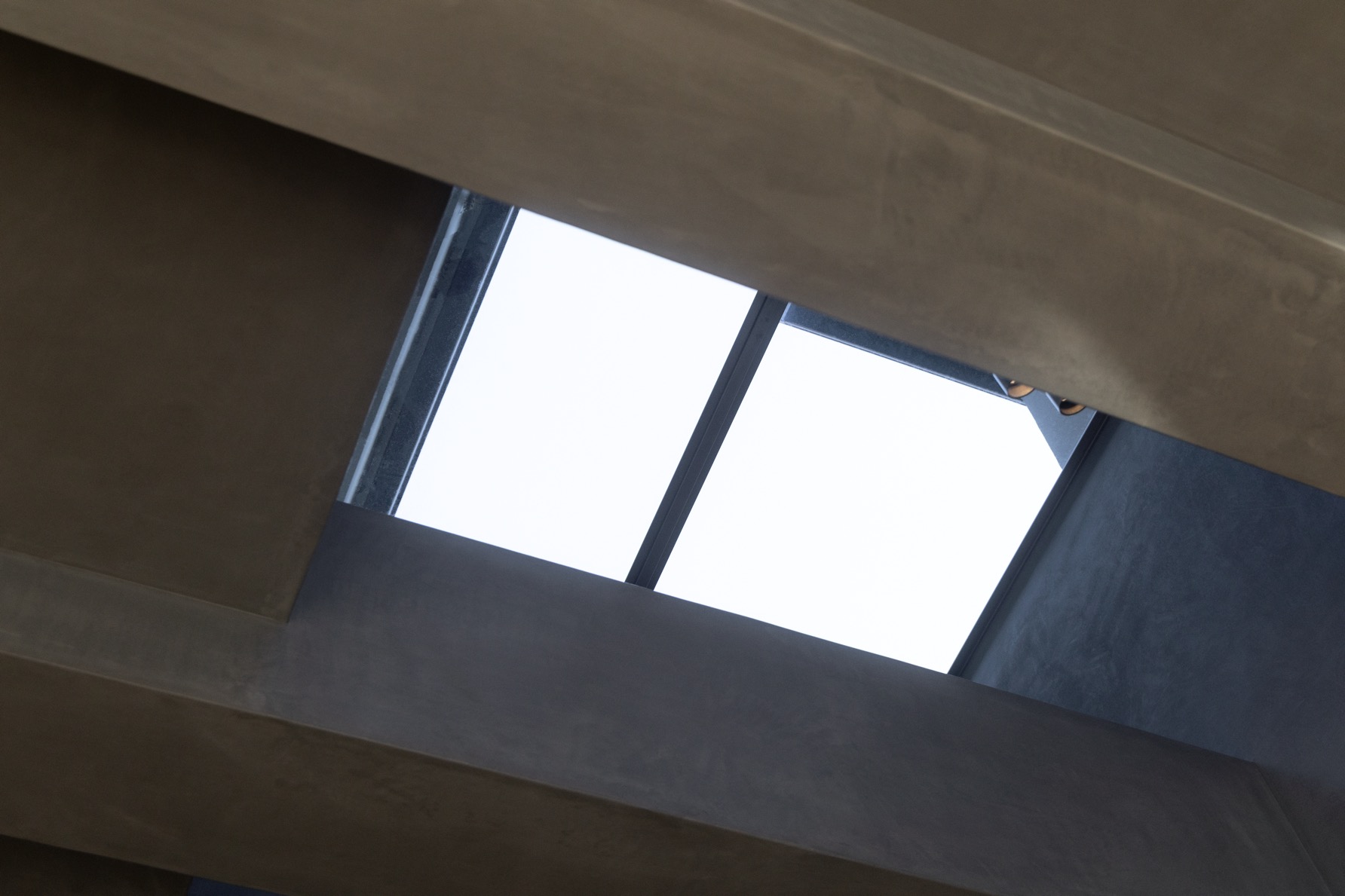
First, we began by understanding the building itself. We stripped it down to its skeleton to examine the structure of all the beams and columns, considering the flow, lighting, and structural reinforcement while determining openings within the framework. Deciding how to frame the views from the seats and assessing lighting variations based on the time of day were tasks that could only be done on-site.
-
-
-
A
What part of the project do you find the most appealing?
-
S
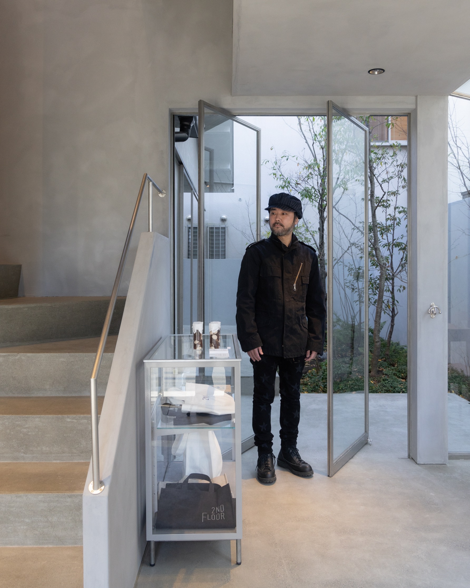
Stepping into the first-floor entrance of the café, 2ND FLOOR, you pass through a sunroom and catch sight of the interior of A&S Zaimokuza’s retail space through the courtyard. This flow strikes me as remarkably beautiful. It functions as a pathway for the breeze, bridging the gap between the exterior and interior sections of the store, blending the two spaces seamlessly. The landscaping of the courtyard was entrusted to TSUBAKI, and it features mainly native species that evoke the seasons, such as camellia and hydrangea.
-
A
The courtyard is indeed a focal point of this store. Sonya once visited a small Hermès store located by the seaside in southern France that had a unique selection, including swimsuits. Similarly, we hope this store attracts those who spend their weekends or summer vacations in Kamakura, encouraging them to take a stroll along the nearby beach or enjoy a leisurely lunch or wine at 2ND FLOOR. The café offers dishes featuring locally sourced ingredients and natural wines.
-
S
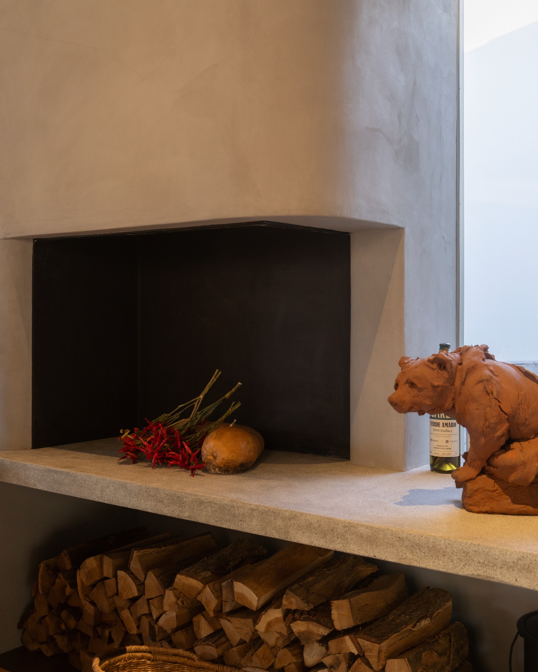
Just like in A&S Daikanyama, 2ND FLOOR features its own fireplace. The warmth it provides enhances both the space and the food, don’t you think? We also designed the kitchen floor to be lower on a stepped level, aiming to create a more intimate atmosphere.
-
-
-
A
How does the Zaimokuza store differ from the others?
-
S
Our philosophy remains unchanged. We consistently strive for interior designs that are simple, refined, and timeless. It’s about embracing the building and its setting, discerning how to best utilize the space. While interior design often emphasizes the surface, in A&S stores, we aspire to evoke not just the outward appearance but also the deeper, spiritual aspects.
-
A
In Japan, it seems architects focus on the structure, while interior designers handle the interior spaces. However, in Europe, where new constructions are less common, architects often take on both roles, managing both the interior and exterior design. Your work seems to lean more towards architecture in that regard, doesn’t it?
-
S
It’s hard to say. Although I begin with an existing building as a foundation, I typically overhaul not only the surface but also the structure and utilities. With my focus on the interplay between the interior and exterior, my process feels quite similar to reconstruction.
-
A
While the store is a public area welcoming to all, it’s also a vital canvas for A&S’s expression. The gray walls in Kamakura were also plastered. Though the nuances may escape notice by many, it’s rewarding if everyone can intuitively sense, “There’s something appealing about this space.”
-
S
That’s right. The interior features a plaster finish, with the color of the resin mortar meticulously adjusted during application, culminating in a polished finish. The craftsmanship involved lends it a depth that goes beyond what paint can achieve. However, this level of detail does extend the project timelin
-
A
It’s similar to Sonya’s approach to clothing design, isn’t it? I believe that’s one of the reasons why we trust you with our projects. There’s also a sense of reassurance that comes from our longstanding collaboration and the excitement of crafting a shared vision together. What do you think are the important aspects of communication with Sonya?
-
S
It’s about understanding the requests and expressing my viewpoints clearly. As discussions progress, I start visualizing and sketching. I believe I have a clear understanding of what A&S should stand for. In design, I focus on avoiding unnecessary details and anything that feels out of place, emphasizing quality and simplicity in monochrome. However, this approach isn’t conventional, and my designs might not stand out in competitions due to their understated nature. Nevertheless, it’s genuinely heartening when others grasp this concept. It feels like I’m creating something valuable while staying true to myself.
-
PROFILE
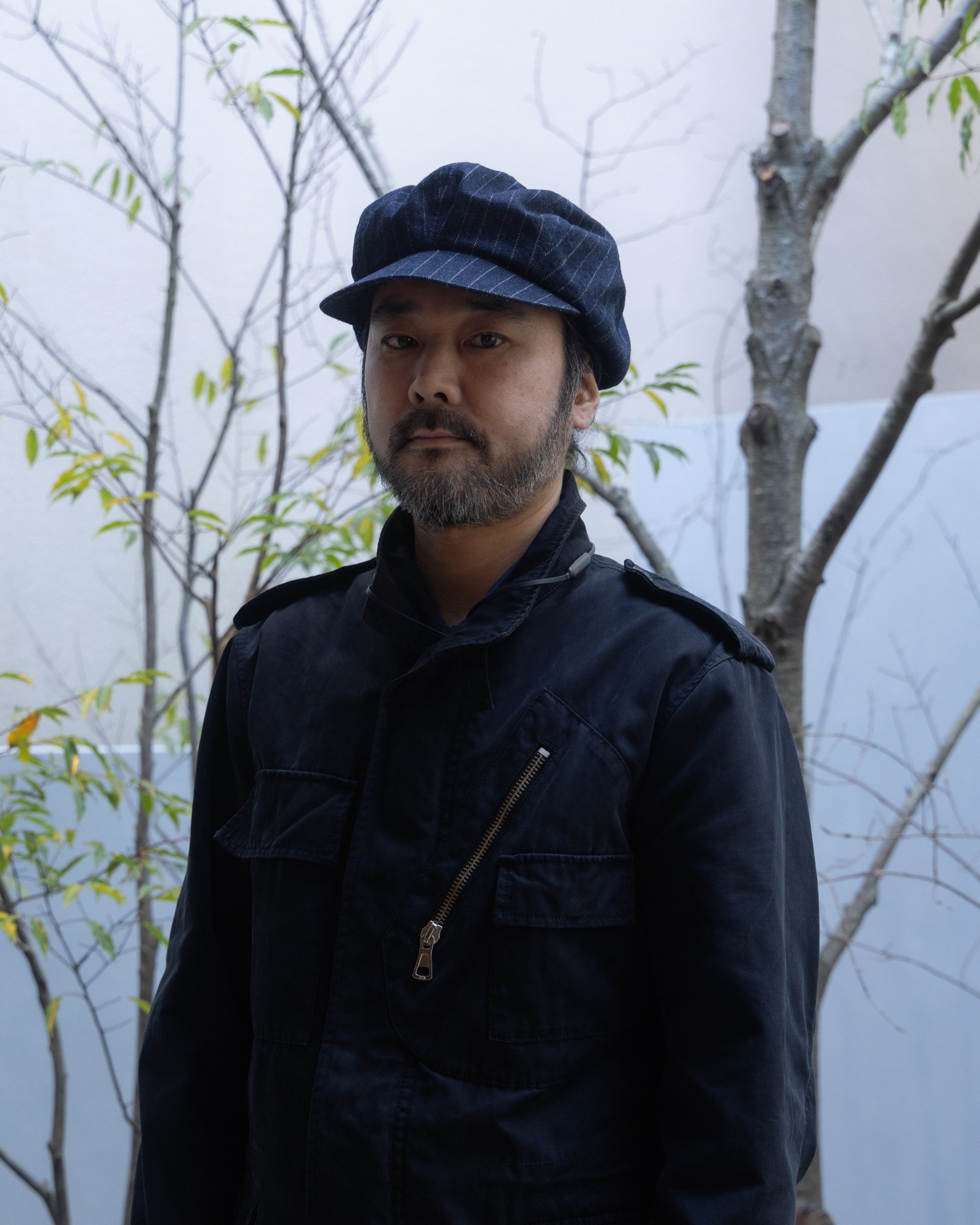
Kazuya Sasaki
SMALLCLONE co.,ltd.
Born in 1977 in Iwate Prefecture. Graduated from the Department of Architecture, Faculty of Engineering, Kanagawa Institute of Technology. Worked at EXIT METAL WORKS SUPPLY~LINE INC. from 1999 until becoming independent in 2008. Founded the design firm SMALLCLONE co., ltd. in the same year.
